Your Custom Text Here
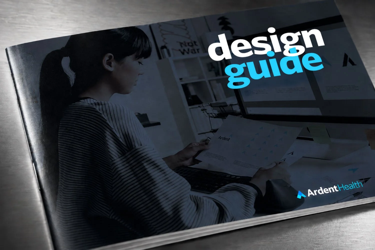
In 2023, after nearly two years of building Ardent’s creative function and brand infrastructure, the timing was right to evolve the company’s visual identity into something that could carry a growing health system forward. Working closely with our CEO and a small internal team, we undertook a ground-up brand development effort: new logo, refined color system, typography, brand voice, and the full standards infrastructure needed to deploy a brand consistently across a system spanning 30 hospitals in six states.
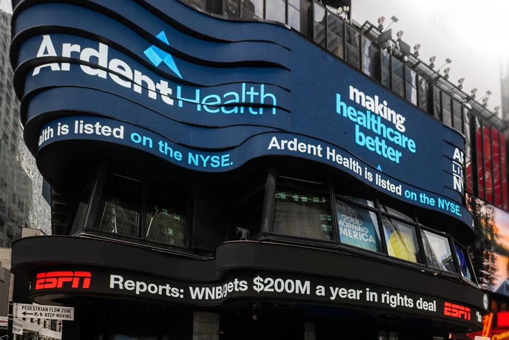
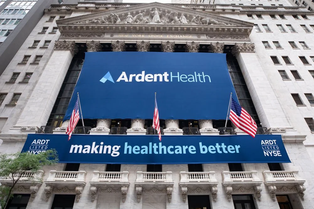
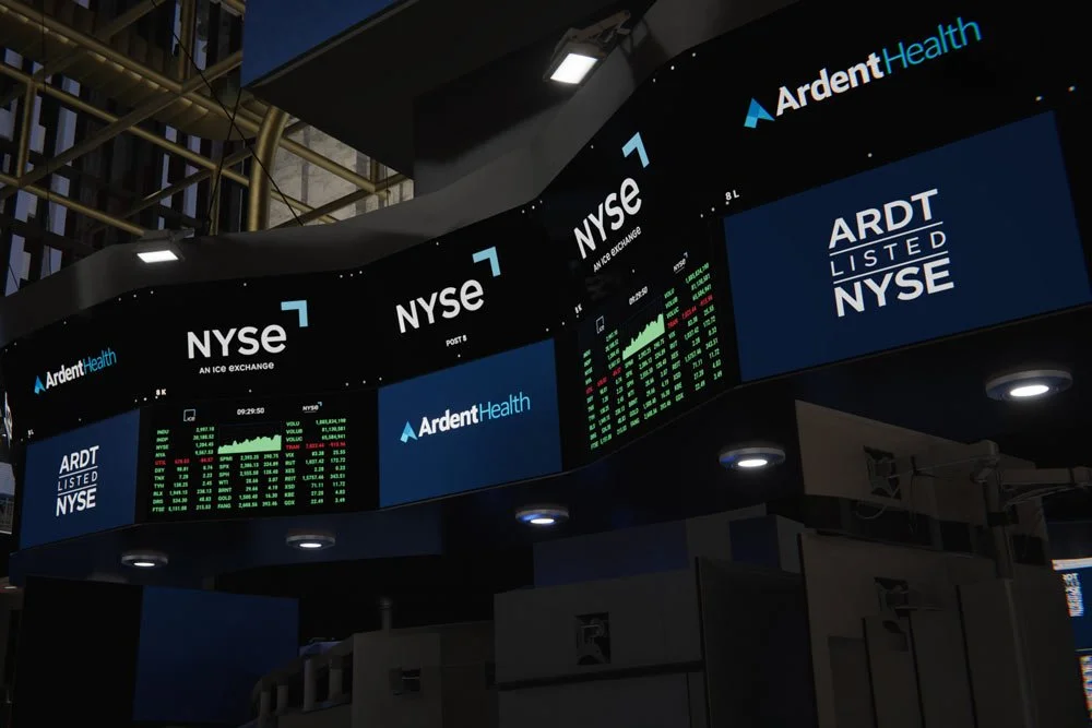
What we didn’t know when we started was that the brand would need to be ready for its biggest moment sooner than expected. On July 18, 2024, Ardent Health listed on the New York Stock Exchange under the ticker ARDT, and the brand appeared on the facade of the NYSE building, across the trading floor monitors, and on the Times Square screens that wrap the corner of Broadway and 44th Street.
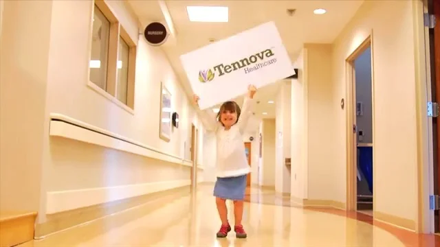
When Health Management Associates acquired a group of Mercy Health hospitals in Tennessee, the name had to change. Mercy Health still operated elsewhere, and the conflict made a full rebrand mandatory. Working on a compressed timeline, I led the creative initiative across a coordinated team of agency partners.
Together we created an entirely new health system identity from scratch: name, logo, brand system, signage, collateral, and a launch campaign. Tennova Healthcare emerged as a modern, regionally rooted brand built to signal a fresh start for healthcare in the markets it served, introduced to consumers who had known these hospitals under a different name their entire lives. The system later grew to 16 hospitals under the Tennova brand.
Partners: Beber Silverstein Group (Miami), AcrobatAnt (Tulsa), The Principle Group (Knoxville, signage).
Tennova - Referee/Sister: Walk Away
Tennova Launch 1
Tennova Launch 2
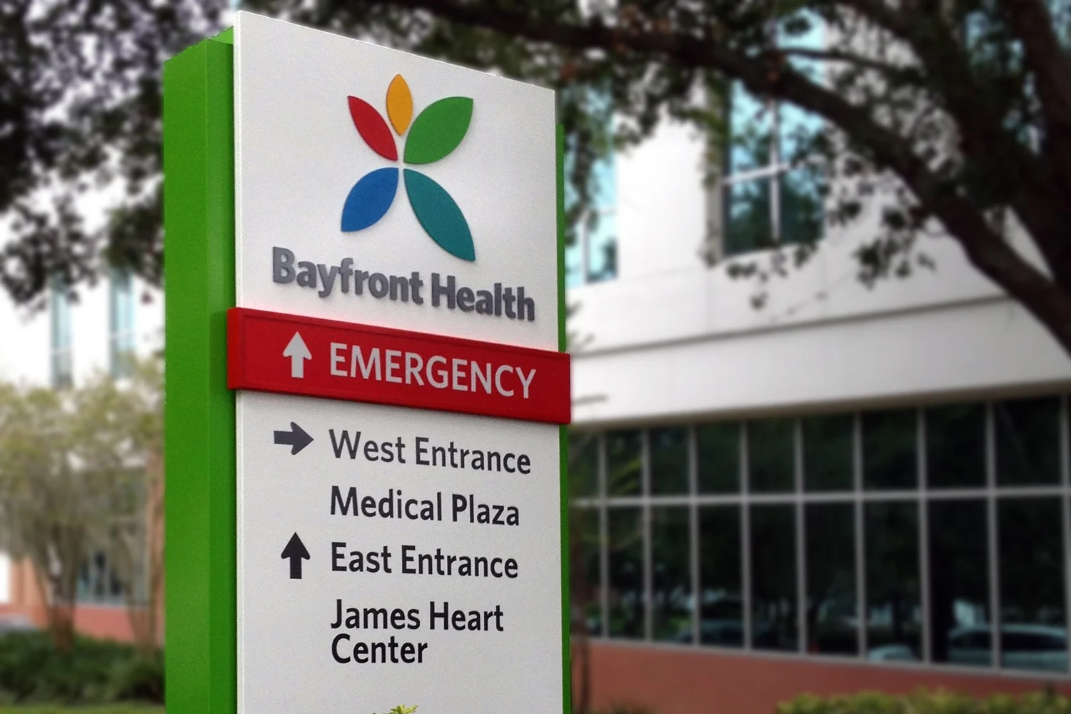
When Health Management Associates acquired Bayfront Health in St. Petersburg, it already owned six community hospitals along Florida’s Gulf Coast. The opportunity was to bring all seven facilities together under one unified brand, a regional system with the combined resources to serve patients across a 140-mile stretch of the Gulf Coast.
On an accelerated schedule, I led the brand development across a coordinated team of agency partners, building out the full identity system: logo, brand voice, signage, print, outdoor, and broadcast. The goal was to make the consolidation feel like an upgrade for patients, not just a corporate reorganization. The result was a brand confident enough to anchor a regional system, flexible enough to work across seven distinct facilities, and clear enough to communicate a simple promise: more resources, closer to home.
Portions of this work were done in partnership with The Beber Silverstein Group.
Bayfront Brand Rollout
Bayfront - Front and Center
When I arrived at Ensemble Health Partners in 2015, the company had a name, a bare-bones logo, and a website, and it was doubling in size every quarter. Building a brand in an organization growing at that pace was less a design challenge than a cultural one: how do you give a company an identity when the company itself is still figuring out who it is?
I started by redesigning the logo, the foundation everything else would build on, and then worked outward from there: brand system, brand voice, collateral, web, internal communications, and environmental graphics. The biggest initiative was The Ensemble Difference, a program I conceived and developed in close partnership with the CEO and HR team to codify what Ensemble stood for and what it expected of its people. The Ensemble Difference became the cultural backbone of the organization, expressed through a book distributed to every associate, wall graphics covering thousands of square feet of the company’s new office space, signage, screensavers, and a sustained internal communications program.
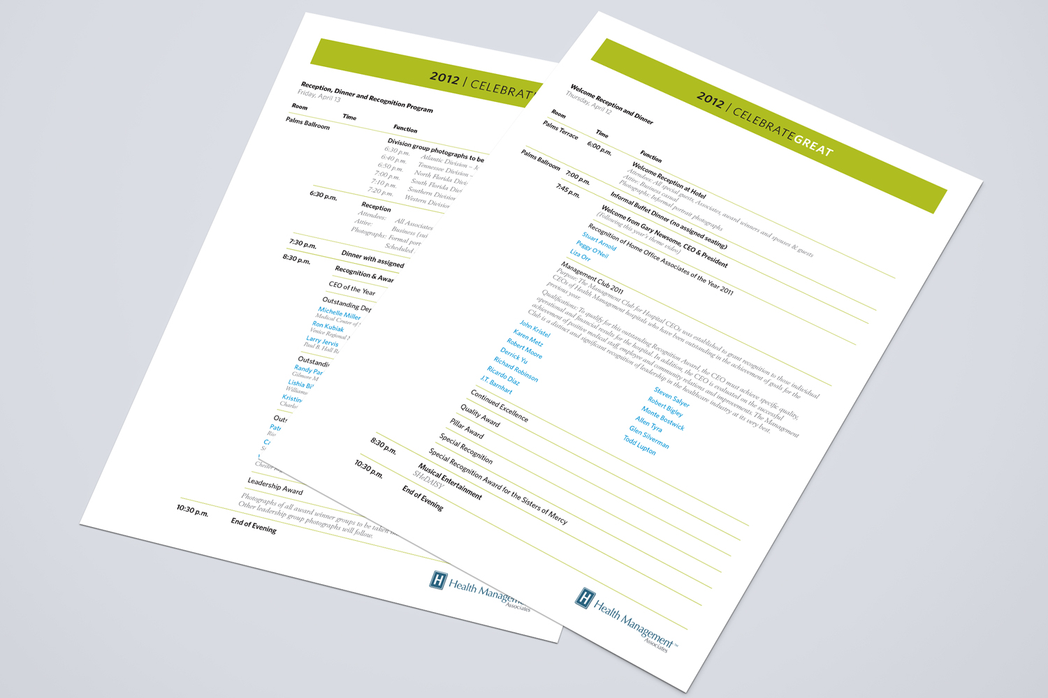
Health Management's annual business meeting and recognition event needed a boost. Not just a name, but also a brand. A brand characterized by a consistent tone, décor, videos and presentations that met the standards of the participating C-level administrators and executives.
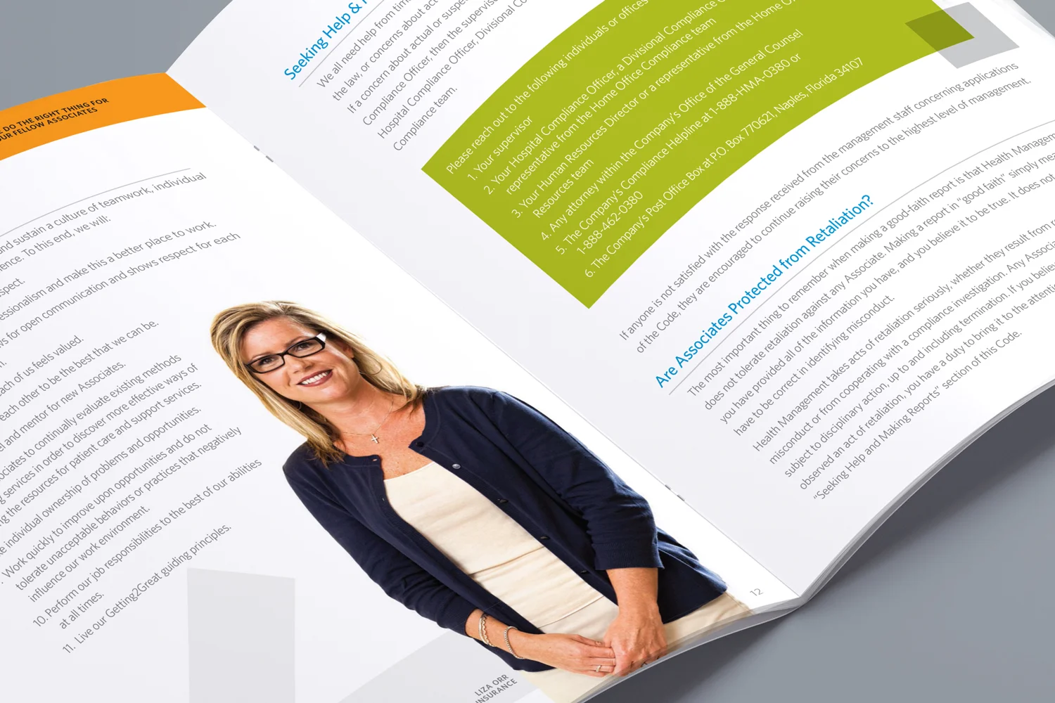
Simply put, the creative director is the keeper of the Health Management brand—establishing and maintaining strict graphic standards, corporate identity and a consistent look/feel that is clean, clear and direct.
Portions of this work were with our agency partner, AcrobatAnt (Tulsa, OK).
HMA - Leading change
The Story of Health Management
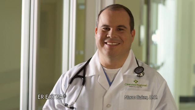
Marketing an emergency room is a strange challenge. You can’t predict when someone will need you, and you can’t manufacture urgency. What you can do is make sure that when the moment comes, people already know your name and trust it.
ER Extra was Health Management Associates’ branded emergency room strategy, designed to standardize ER marketing across the system and distribute creative costs across 71 hospitals rather than developing campaigns independently for each market. The logic was straightforward: one powerful brand, deployed consistently, is more effective and dramatically more efficient than a variety of local efforts saying roughly the same thing.
I led the creative program in partnership with our agency partners, overseeing campaigns that ran across print, outdoor, digital, and broadcast in markets across the system. The creative leaned into smart, slightly unexpected healthcare messaging: typographically playful door hangers that made people stop and read, billboards that reframed common symptoms as potential emergencies, and a brand voice that was direct without being alarming.
A partnership with NASCAR driver Mark Martin, brokered by our agency partners, extended the brand’s reach into a demographic that overlapped strongly with ER utilization patterns, bringing the ER Extra name into a context where most healthcare brands never venture.
Portions of this work were with our agency partners, Beber Silverstein Group (Miami, FL) and AcrobatAnt (Tulsa, OK).
Mark Martin TV1 - 2013
When nothing is more sacred than the brand, the guidelines for print, promotional, video and Web usage become the bibles for design and content, system-wide. Requiring equal supervision, the collaboration of multiple partners and months of development was the revamp of Marketing Central—the online store from which individual hospitals order everything from full campaigns to individual ads to promotional items.
When Medicare rules changed, many services and screenings became free to the consumer, yet providers were still reimbursed at standard rates. To capitalize on this potential revenue, Health Management developed a full-fledged campaign for physician offices. These friendly materials informed Medicare recipients, educated clinicians and equipped clinic staff with internal and external marketing pieces.
Finding the right primary care physicians and specialists is key for any health system. Health Management created materials that invited these medical professionals to work where others chose to vacation, selling the concept of having a successful career as well as a satisfying lifestyle. An elaborate brochure promoted Health Management as an overall choice, and provided space for hospitals to personalize information.
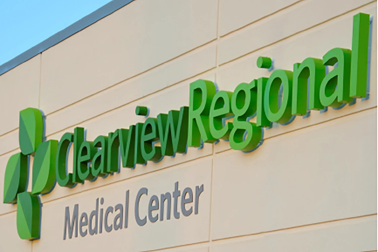
When a hospital with an aging building and lingering perception issues was finally getting a new facility, the time was ideal for rebranding. With a new name and identity, Clearview Regional Medical Center emerged—complete with a fresh look and new lease on healthcare.
The Choice is Clear 1
The Choice is Clear 2
Healthcare is a policy-driven industry, so Health Management created the Good Government Council as a mechanism for getting local executives and employees involved in local political issues and advocacy. Members of this group were also encouraged to build relationships with policy makers and to make the position of the hospital known to political leaders.
© 2026 Jon Nedry